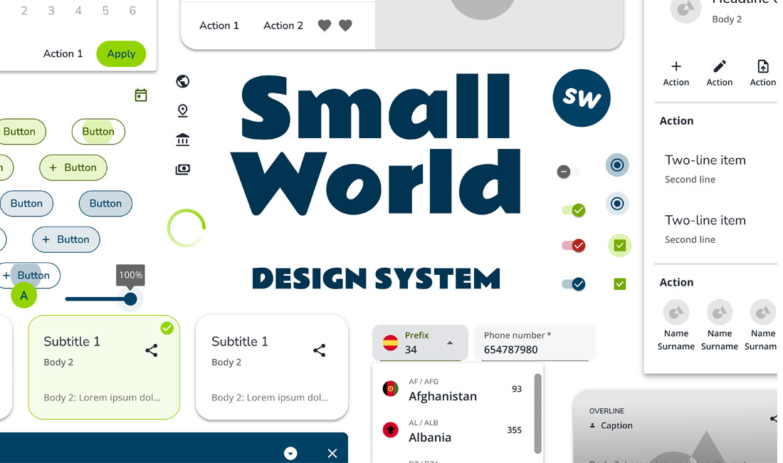

This case study explores our process, challenges, and the impact on SmallWorld’s digital landscape.
Product Design Manager
Smallworld Financial Services
Prior to this project, SmallWorld lacked a unified design system. The web platforms, mobile app, and internal management systems had inconsistent, independent styles. This fragmentation stemmed from the evolution of products over the years, with hardcoded styles that made implementing changes difficult. This situation presented several key problems:
As part of this project, we delivered three distinct design systems for SmallWorld Financial Services: web, mobile, and an intermediate version. This approach addressed several technical and strategic needs across the company’s platforms.
Firstly, we used Material 3 solely for the mobile app (developed in Flutter), as Material 3 was not yet fully optimized for web applications. To maintain visual consistency and functionality on the web, we implemented Material 2 for the Angular platform, which was better suited to SmallWorld’s existing web infrastructure.
The intermediate version was developed as a temporary solution for the existing website, which had become visually inconsistent and outdated over time. This version allowed us to bring an updated look to the website while we worked on the full Material 2 implementation. The brand image was deteriorating due to the old design, and this intermediate approach helped enhance its appeal to consumers by providing a fresher, more cohesive look.
This phased approach not only allowed us to deliver visible improvements more quickly but also bought us time to complete a thorough implementation of the Material 2 web design system.
Initial analysis: We conducted a thorough evaluation of the different platforms (web, app, and internal systems) to understand their current state from a UX/UI perspective. We focused on identifying common components, visual inconsistencies, and usability issues.
This included:
Benchmarking: We compared our systems to leading design systems such as Material Design and Carbon, identifying key elements to integrate into our system. We also took into account how some of our competitor like RIA or AZIMO where solving some specific elements.
We defined a clear strategy to create three different design systems, tailored to SmallWorld’s technical constraints. This included:
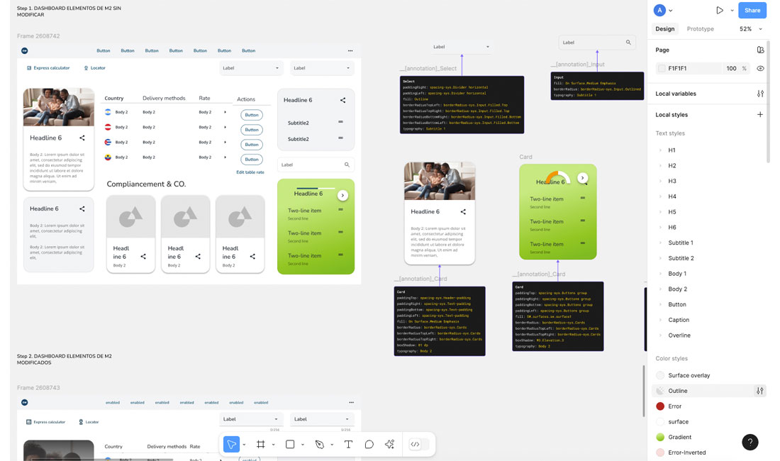
The ideation and solutioning process for SmallWorld’s design systems focused on enabling both designers and developers to work with high efficiency and scalability. Token Studio, integrated with GitHub, facilitated the creation and synchronization of design tokens, allowing us to manage multi-themes in real time.
Token Studio enabled us to manage design tokens that controlled visual properties (e.g., colors, typography, spacing). We defined global and component-specific tokens, ensuring visual consistency across our three design systems.
One of Token Studio’s strengths is its GitHub sync, which allowed continuous integration of design updates from Figma into GitHub. This enabled developers to access changes instantly, reducing manual reviews and supporting consistency.
GitHub integration also helped us create multi-themes by allowing tokens to control different themes (like light and dark) without duplicating work. Changes in one theme applied seamlessly across all, saving time and ensuring uniformity.
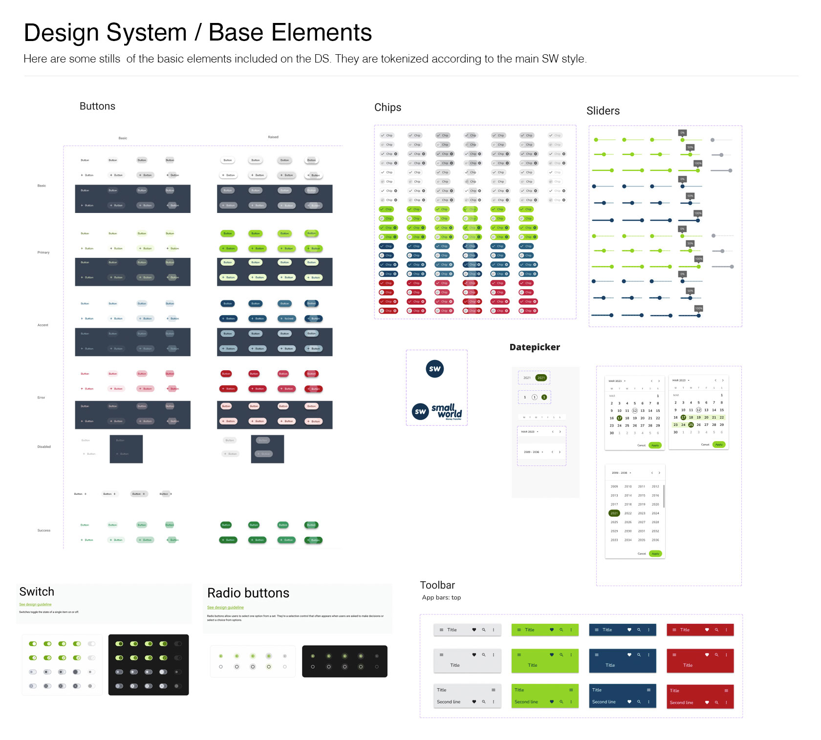
We organized Figma libraries with standardized components (e.g., buttons, forms, typography), providing a foundation that sped up the design process and improved coherence across SmallWorld’s platforms.
For designers, these libraries served as a central source for approved elements, allowing for quicker interface design without reinventing components.
On the development side, these Figma libraries had corresponding GitHub repositories where design components were defined in code. This ensured that updates in Figma synced directly with code, allowing for faster implementation and minimizing duplication.
The ability to see design changes immediately reflected in the code enabled an agile workflow, improving collaboration between design and development and eliminating the need to recreate designs in code.
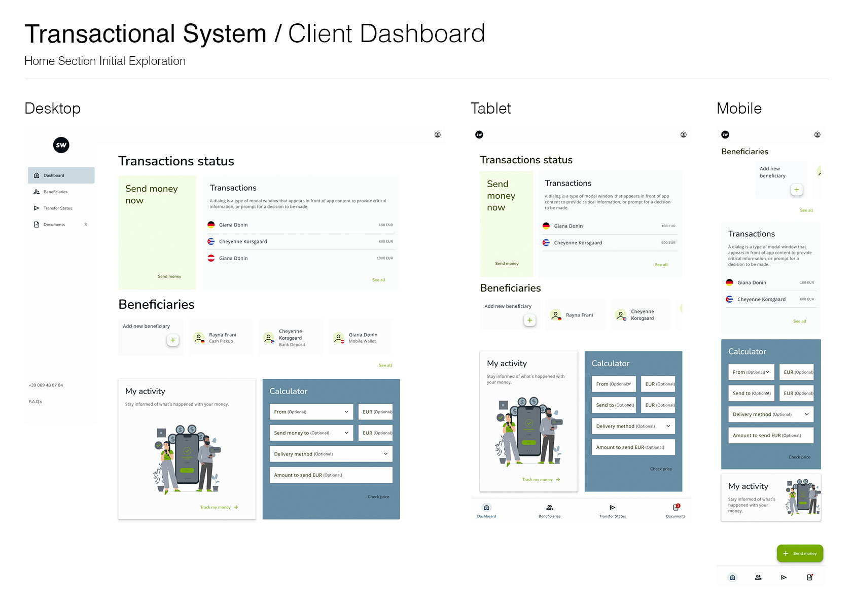
Functional prototypes: We used Figma to create prototypes covering the main interaction flows. These included forms, dashboards, and key screens for both the app and web. We ensured the prototypes reflected real functionality, including form field states, error messages, and real-time interactions.
Iterative testing with users: We conducted tests with both internal and external users to validate the usability and consistency of the new design systems. This process helped us identify key areas for improvement in the user experience and make necessary adjustments before the official launch.
Collaboration with development: We worked closely with the development team to ensure the design systems were correctly implemented. We used GitHub to manage component libraries and synchronize them with Figma, facilitating agile and scalable implementation. We started with registration forms, then progressed to dashboards and more complex user flows.
Testing process: During development, we conducted extensive tests in collaboration with QA, ensuring that components behaved correctly across all platforms and resolving any inconsistencies identified.
We implemented a detailed GUI testing plan (Want to check it out?), covering size, position, usability, and navigability of interface elements.
We released the first pages of the corporate website and Omnex platform, as well as an internal Beta Version of the Flutter app .
We also released the first pages of our current Site with the revamped styles, in sync with the Branding Guidelines.
These initial releases allowed us to gather real user feedback to continue iterating while we worked on the next phase of the project.
As Product Design Manager, this project highlighted the value of an adaptable, phased approach. Tools like Token Studio and GitHub enabled real-time updates and alignment across teams, while the intermediate design system allowed us to deliver quick wins, enhancing the brand and managing stakeholder expectations as we worked toward the full Material 2 implementation .
From a company and team perspective, the project underscored the importance of cross-functional collaboration and continuous iteration. By establishing feedback loops and leveraging centralized Figma libraries, we accelerated design workflows, ensured consistency, and refined the system based on real user insights, minimizing risks during ongoing implementation .


